Commercial Property Management App
Summary
As the only UX designer on CBRE’s TransAct application, I performed discovery research, user interviews, and prototype testing before delivering a final design that met our stated business objectives.
TransAct Dashboard
Context
TransAct is a Salesforce application designed to streamline and manage commercial real estate transactions. Hundreds of Fortune 500 businesses and CBRE account managers use TransAct to monitor property management timelines and workflows.
For example, Coca-Cola’s global commercial real estate holdings are divided into regional portfolios that include numerous locations and multiple types of real estate: offices, industrial manufacturing, logistic centers, etc. TransAct enables our clients to customize their property acquisition strategy and management schedules in one place.
One facet of the business strategy leverages AI and machine learning to integrate clients’ property management data with CBRE’s extensive real estate market knowledge. This outcome generates new opportunities and enables us to provide more value to our clients.
Problem Statement
The business challenge we had to solve was that very few users engaged with the Date Management tab of the application. This tab is a major strategic priority in gathering market data to generate predictive recommendations for our clients.
The existing design allowed users to upload their own property management templates and customize the platform for their specific processes. However, client feedback was mixed. Most clients stated that the existing design didn’t support their workflows.
Our group was tasked with measuring and increasing client engagement with this tab.
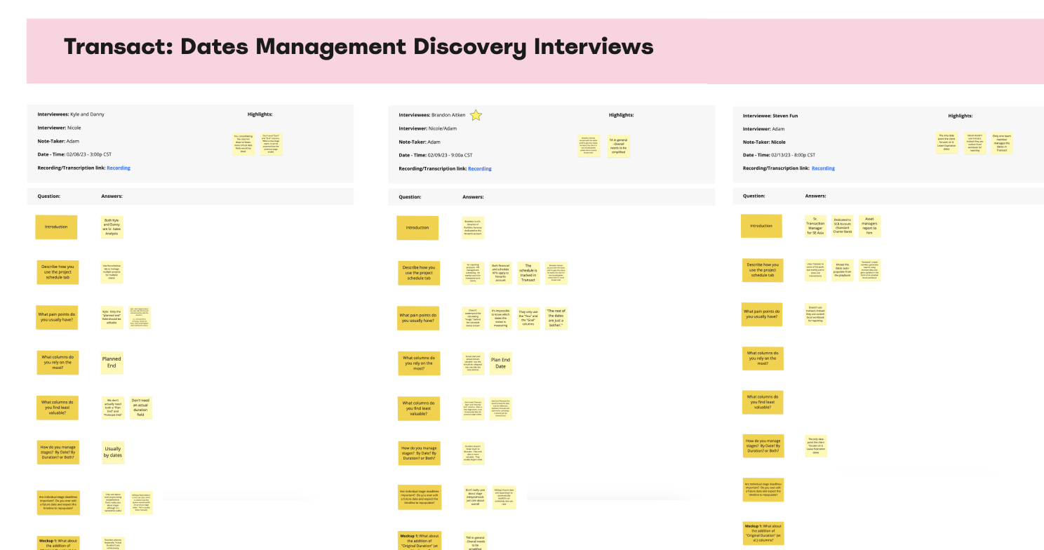
Discovery interview notes
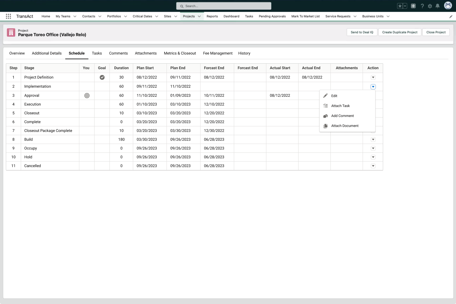
Legacy Date Management tab
Discovery Research
As the “UX team of one” on this project, my first task was to perform end-user interviews to discover pain points in the user journey.
I discovered two major pain points:
1) The date management feature of the existing platform only worked for a small minority of our clients. When a phase of a project was extended, the original implementation team assumed that the ultimate end date of the project would be extended by the same amount of time. Most clients needed the capability to edit individual phase and task due dates.
2) The existing datatable had so many date columns that it was virtually unusable. With six consecutive date columns in the table, the “eye chart” effect was creating a major readability issue.
To track my research, I recorded all user responses in a Mural board, and then collaborated with my product manager to create a jobs-to-be-done (JBTD) list expressed in the form of user stories.
Refinement
My product manager and I analyzed the results and created a new user flow to help us visualize the key requirements of the new design.
After this step, I created three prototype iterations, each time incorporating feedback from my development team and other internal stakeholders.
Our solution was

Research-based user flow

Redesigned tab with Gantt chart
Key Takeaways
Interview your most vocal critics! I intentionally involved our most critical stakeholders and end users in this process. Providing them an opportunity to express their opinions and provide input into the design process was seen as a gesture of goodwill. In two cases, I was able to “convert” some of our most outspoken critics into “soft” evangelists for our new solution.
Although the Gantt chart is not an LWC component, CBRE has a library of internal Salesforce components that my team was able to leverage. This reduced the estimated delivery time by at least 6 weeks.
We implemented analytics on the screen to track the engagement numbers after release. Our business requirement was to increase user engagement by 10% before end-of-year. Analytics showed an increase of more than 40% in the month after our release announcement. My PM planned a roadshow to evangelize the new feature and train our user base on the design.
Prototype Testing
Having designed a clickable, high-fidelity prototype, I returned to our same base of users and tested their reactions to the new solution. Specifically, I wanted their feedback on three new components of the design:
A new date management toggle
A show/hide column feature
An interactive Gantt chart component to aid in their project management.
The solution tested very well with 8 out 10 users saying they would start using the feature. My team moved forward by refining the implementation into user stories and epics.