Project Color
Summary
As a designer on the award-winning ProjectColor App, I made difficult design decisions and expanded my UX skillset through testing and research.

ProjectColor Userflow
Discovery and User Journeys
I was hired to be the UX Architect of the new ProjectColor app. The business strategy was to create an app that allowed the consumer to preview paint colors in their own homes using their own photos.
The Home Depot sells $7 billion of paint each year, and this single product department generates more than 10% of the company’s net margin.
I began with discovery. We interviewed internal stakeholders as well as customers (in both the contractor and DIY segments) to learn about pain points and difficulties in the existing paint-purchasing user journey.
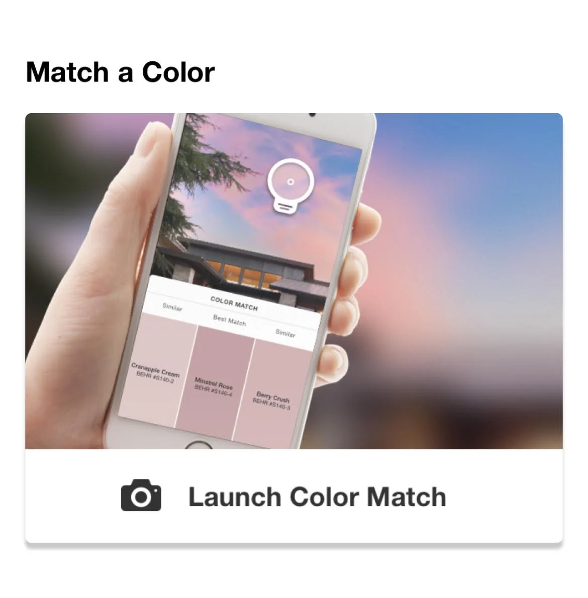
We learned that the two most desirable features were: (1) to match an exact paint color to a mobile photo, and (2) to preview paint colors in the user’s own home.
From these discovery results, we made a high-level jobs-to-be-done (JBTD) list expressed in the form of user stories.
Based on these user stories, I was able to make an initial userflow of a 4-tab mobile app. We tested several iterations of the navigation prototypes as well as all major screens and interaction processes in the app.
Design Challenge #1 - Navigation
One of the first difficult decisions I had to make was whether to recommend that both the iOS and the Android apps use the same navigation structure. A disproportionately large percentage of my colleagues (both on the product and engineering teams) were Apple users, and they recommended that the Android team artificially recreate the iOS app navigation structure for the sake of consistency. In their words, regardless of what Android users are used to doing, Apple provided an overall better user experience.
The Android convention of using the “hamburger menu,” in their analysis, was a crutch that enabled a sloppy information architecture. “It’s like a junk drawer for navigation,” one of my colleagues said.
On the other hand, I suggested that Android users have come to expect the “three lines” menu, since it is an almost universally recognized icon across a majority of apps in the Android ecosystem. “It’s a deeply ingrained expectation of the Android users’ mental model, and they don’t view it as a negative design feature.”
Deadlines were looming and my management favored a quick resolution. Using UserTesting.com, I decided to create a usertest to generate actual data as the basis for this decision. I tested 5 different navigational patterns with an audience of only Android users. (One of the patterns tested was the native iOS version.) In the end, Android users overwhelmingly preferred navigating the app using the “hamburger menu.”
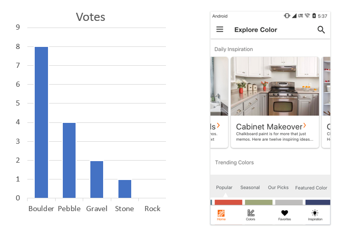
Navigation User Test Results
SetBack
About one month into the project, my UX designer resigned.
It took six months to hire the backfill for his position. During this time, I worked as a “team of one” to deliver all final UX designs for handoff. This included supporting both the iOS and Android native app development teams with all assets and final deliverables.
Although I had worked as a part-time UX designer in the past, this was by far the most high-profile design work I had done to date. In retrospect, I’m grateful for the opportunity I had to work as a UX designer at this level, as it put me in a position to grow my skillset and gain a more holistic view of the design process.
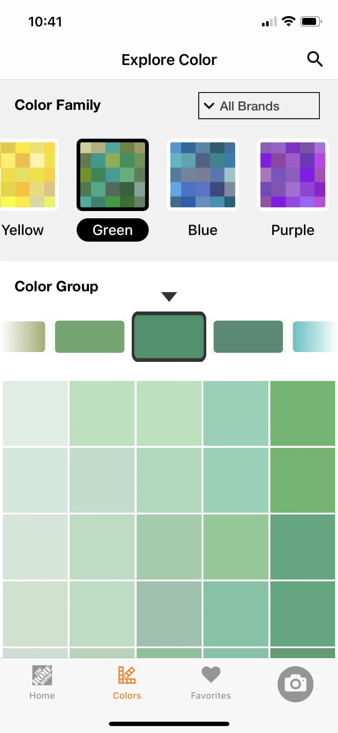
Design Challenge #2 - 3,500 Colors on one screen?
We invested a significant amount of time and research into the “Color Wall” feature of the app. The Home Depot’s paint vendors sell approximately 3,500 unique paint colors, meaning, “named” colors with individual SKU numbers. How could we create a delightful browsing experience of 3,500 colors on a mobile-sized screen?
We analyzed this challenge from numerous angles. Although we were using colors instead of words, it was still ultimately a question of finding the optimal information architecture.
We tested several design ideas—including presenting only a limited set of featured colors. The design that tested the best was a 3-tiered hierarchy, with both search and filter features.
An additional challenge was figuring out a programmatic way to generate the order of the color tiles in a natural looking way. We worked for several weeks with the machine learning team to test and set the proper hue-saturation-luminosity parameters of the data set.
Key Takeaways
Test always and listen to feedback from your users! As a designer, it’s easy to imagine that my own solution to a design challenge is also the best solution. Not only is this a lazy approach, but it is also the opposite of practicing empathy. Listening to the needs of your users through research and prototype testing at the critical phases of the design process is truly the best way to drive collaboration with stakeholders and achieve the business goals of your company.
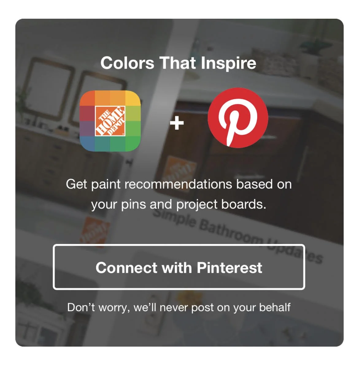
Continuous Feedback: Pinterest integration
Within 2 months of release, ProjectColor was generating more than 2,100 new paint orders each week.
We received a call from Pinterest to discuss a potential partnership and integration.
One of the chief user behaviors we discovered concerned browsing for inspiration. We found that users preferred to browse for color ideas using Pinterest, and then uploaded their pins into our app to identify the paint color.
We invited the Pinterest UX team to Atlanta to participate in a week-long design sprint during which we were able to learn about their API capabilities and technology stack. In the end, we were able to build an integration that allowed users to browse their Pinterest boards directly in The Home Depot ProjectColor app.